COVID-19 is not a hoax. I personally know and have spoken to several people who have had it. It is an experience similar to but worse than the flu, seems to last longer, and may have permanent effects. Please continue to be careful and follow all reasonable directives from the government and public health officials.
All my graphs are based on data found here. Feel free to browse that data and confirm the below information for yourself.
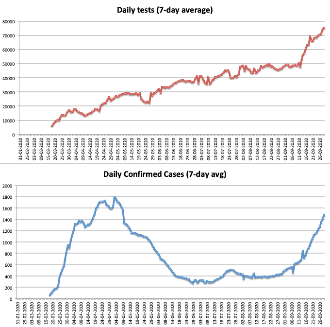
Graphic 1 – Daily Tests (top) and Daily Confirmed Cases (bottom)

Looking at the bottom graph, it certainly seems like we’re having a second wave! And it’s true, there are a lot more confirmed cases of late. That seems to be the big news we hear on repeat. But that number should always be paired with the total number of tests being done. We are testing more and finding more, and that makes sense. And this needs to be mentioned as often as the “second wave” terminology.
How many people in Canada have COVID-19? The answer is: nobody knows. The only way we could know is if all 38 million of us take a test everyday and get the results immediately. The “confirmed cases” number is related in some way to the absolute number of cases, but we’re not exactly sure how.
This is why the “confirmed cases” number alone is insufficient to make the case that’s we’re having a second wave that looks exactly like (or worse) than the first one. This number tells us how many cases have been discovered but not how many cases there actually are right now. Are there more or fewer people with COVID-19 now than at the spring peak? Again, we don’t actually know.
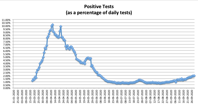
Graphic 2 – Positive Tests (as a percentage of daily tests)

There has been a slight increase in positive cases as a percentage of daily tests. Currently, just under 2% of tests yield a positive result. That number peaked in April with over 10% positives. Keep in mind that this is not random sampling. The government is providing the following guidance on who should get tested:
“Contact your local health authority for advice about testing if you:
- think you may have COVID-19
- have been in contact with someone who has COVID-19”
Summary: Even among people who suspect they might already have COVID-19, the positive test percentage is currently under 2%.
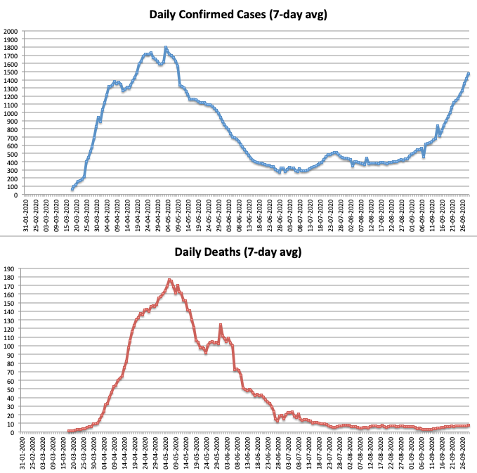
Graphic 3: Daily Confirmed Cases (top) and Daily Deaths (bottom)

There are many more tests being done and more positive cases being found. What about the number of daily deaths? You can see that this number has barely moved and has been in the same range (below 10 per day) since around mid-July. This fact should be pointed out far more often than it is.
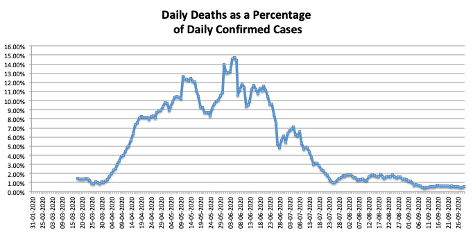
Graphic 4: Daily Deaths as a Percentage of Daily Confirmed Cases

Daily test rates are up and as a result the confirmed case rate is up, but the daily death rate is is not ruling parallel to the confirmed case rate like it did during the first wave. As you can see, the “second wave” terminology alone is unhelpful. There certainly appears to be a second wave of confirmed cases, but we’re looking harder now and doing a lot more testing. There is not yet a second wave of deaths – and here’s hoping there never is. Please notice that while the “Daily Confirmed Cases” peak is nearing the previous peak, at the same time the “Daily Deaths” average is down by 95% (177 on June 5 vs. 8 on Sept. 29).
Summary: Every death from an (at this point) incurable disease is a tragedy. But as I stated in my last update, hysteria and the possible ensuing mandated lockdowns based on inflated and incomplete information is going to do more harm than good.
Being constantly angry about all this isn’t helping either. I’ve been angry and frustrated at times. I choose to look at the data, make sense of it, and show what I’ve found to others. I believe that if enough people do that we can have a positive impact on our elected officials, who seem to (at times) make decisions based on media narratives instead of hard data.
So go forth and share what you’ve learned. Be a reasonable and calm presence in the lives of those who are drowning in a second wave of fear.

